Note
Click here to download the full example code
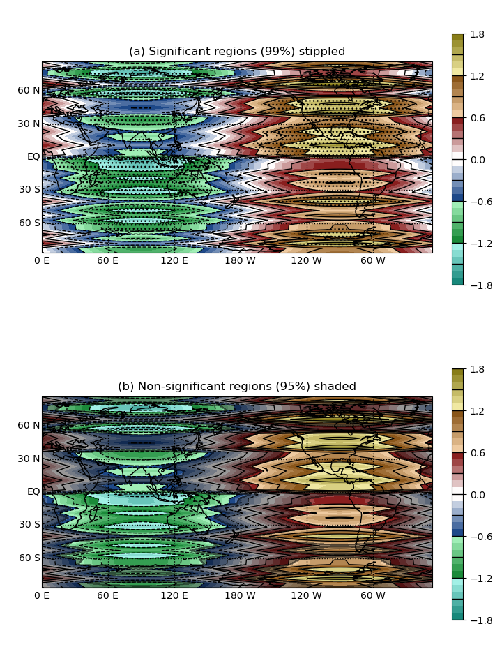
Plot a significance mask
Compute a linear regression using pygeode.regress() and use pygeode.vsigmask() to plot significance
import pygeode as pyg, numpy as np
import pylab as pyl
pyl.ioff()

from pygeode.tutorial import t3

# Compute regression
reg = pyg.regress(t3.X1e, t3.Y1, ['time'], output='m,b,r2,p')


pyl.ioff()

# The significance mask routine takes a signed significance mask as it's main
# argument. This ensures that regions of significance on opposite sides of the
# distribution are separated by a filled region. It can be computed as follows
# from the p-value of the linear regression.
sigmask = (1 - 0.5*reg.p) * pyg.sign(reg.m)

ax1 = pyg.showvar(reg.m, fig=1)
pyg.vsigmask(sigmask, ax1.axes[0], mjsig = 0.99)

ax1.axes[0].setp(title = '(a) Significant regions (99%) stippled')

ax2 = pyg.showvar(reg.m, fig=1)
pyg.vsigmask(sigmask, ax2.axes[0], \
                mjsig = 0.95, mjsigp = dict(visible = False), \
                nsigp = dict(alpha = 0.4, hatch = None, color = 'k'))

ax2.axes[0].setp(title = '(b) Non-significant regions (95%) shaded')

ax = pyg.plot.grid([[ax1], [ax2]])
pyl.ion()

ax.render()

Out:
/home/peterh/pygeode/pygeode/plot/wrappers.py:320: MatplotlibDeprecationWarning: You have passed the 'alpha' kwarg before the 'color' kwarg.  Artist.set() currently reorders the properties to apply 'color' first, but this is deprecated since 3.3 and will be removed two minor releases later; please pass 'color' first instead.
  else: pyl.setp([coll[i] for i in self.ind], **self.plot_kwargs)

<Figure size 720x960 with 4 Axes>
reg contains a dataset of values from the regression
print(reg)
Out:
<Dataset>:
Vars:
  m  (lon,lat)  (60,42)
  b  (lon,lat)  (60,42)
  r2 (lon,lat)  (60,42)
  p  (lon,lat)  (60,42)
Axes:
  lon <Lon>      :  0 E to 354 E (60 values)
  lat <Lat>      :  87 S to 87 N (42 values)
Global Attributes:
  description    : linear regression parameters for Y1 regressed against X1e
