Plotting
The plotting system in PyGeode is intended to provide sensible defaults so that you can quickly see a reasonably annotated plot of the contents of a PyGeode variable, but also to allow as much flexibility in customizing your plots as possible. In general it is intended to map very closely to the matplotlib library, and to give you access to as much of the matplotlib functionality as possible. This tutorial is intended to introduce some of the basic concepts; a gallery is also available with sample plots. Though you could use either document as a starting point for plotting even without any matplotlib experience, both will make more sense if you have had some.
There are three levels of plotting commands. The highest levels, mostly
prefixed by show, make the most assumptions about the structure of the plot
they produce. The next level, prefixed with v, are more direct wrappers
around matplotlib commands that are aware of PyGeode variables and try to make
formatting decisions accordingly. The lowest level are very thin wrappers
around individual matplotlib commands that know nothing about PyGeode
variables, but allow for the most direct control. In the end the plots that are
produced are matplotlib plots, so any level of customization that matplotlib is
capable of can be achieved.
The basic high-level plotting command is showvar(), which in its
simplest form will plot a one or two dimensional variable:
In [1]: import pygeode as pyg; from pygeode.tutorial import t1, t2
# A line plot
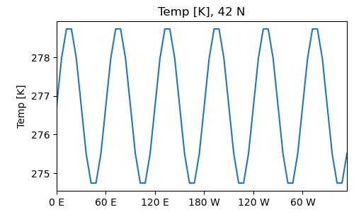
In [2]: pyg.showvar(t1.Temp(lat=45))
Out[2]: <pygeode.plot.wrappers.AxesWrapper at 0x7f3727ce3670>
# A contour plot
In [3]: pyg.showvar(t1.Temp)
Out[3]: <pygeode.plot.wrappers.AxesWrapper at 0x7f37341cac40>
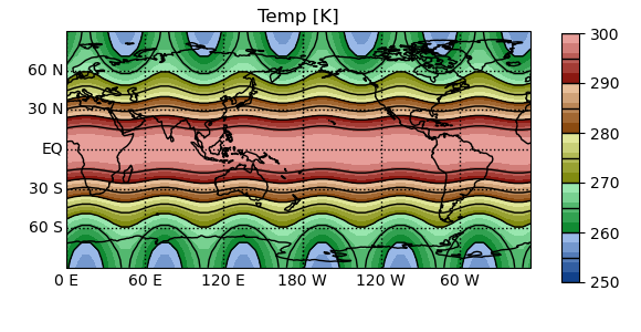
The axes are labelled and formatted according to behaviour set by the axis objects (explained in more detail below), and the title is set from the variable name as well as the coordinates of any degenerate axes. In the case of the contour plots, a colorbar is added automatically.
Showvar: Line Plots
If showvar() is passed a one dimensional variable, it will produce a
line plot (ultimately using matplotlib.plot()), automatically extracting
the coordinates and values from the variable. If the axis is recognized by
PyGeode as being a vertical axis, the plot will be transposed. This can be
reversed if desired by setting the keyword argument transpose = True.
Like the plot command, the format of the line can be set by passing a string
immediately following the command; moreover, any other keyword argument
recognized by matplotlib.plot() will be passed through.
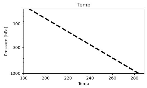
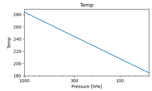
# A vertical plot
In [4]: pyg.showvar(t2.Temp.mean('time', 'lat', 'lon'), 'k--', lw=3.)
Out[4]: <pygeode.plot.wrappers.AxesWrapper at 0x7f373400a430>

# A transposed plot
In [5]: pyg.showvar(t2.Temp.mean('time', 'lat', 'lon'), transpose = True)
Out[5]: <pygeode.plot.wrappers.AxesWrapper at 0x7f3727a824c0>
Showvar: Contour Plots
The showvar command, if passed a two-dimensional variable, will also produce contour plots. If no arguments (beyond the variable to be plotted), a set of (filled) contour intervals and an appropriate colourmap is chosen based on whether it thinks the data is better presented as a ‘divergent’ quantity centred on zero, or a ‘sequential’ quantity; different algorithms for choosing the contour interval are used in each case.
# Sequential data
In [6]: pyg.showvar(t2.Temp(pres=200).mean('time'))
Out[6]: <pygeode.plot.wrappers.AxesWrapper at 0x7f3727d41430>
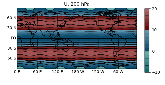
# Divergent data
In [7]: pyg.showvar(t2.U(pres=200).mean('time'))
Out[7]: <pygeode.plot.wrappers.AxesWrapper at 0x7f3727944fd0>
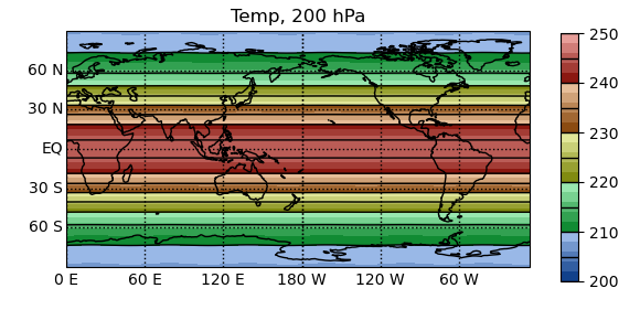
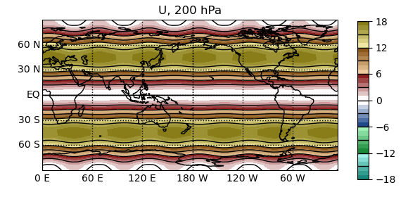
PyGeode tries to choose a reasonably simple contour interval and sets the colourmap and tick labeling accordingly. Since the temperature data is centred away from zero, PyGeode assumes this is better plotted with a ‘sequential’ colourmap, with gradients tending in a single direction. However, the wind data is centred around zero, so the contour intervals chosen are also centred around zero with a colourmap that emphasizes oppositely signed values.
# Create a sequential style colormap with three divisions, three
# contour lines and six filled intervals per division
In [8]: pyg.showvar(t2.U(pres=200).mean('time'), style='seq', ndiv=3, nl=3, nf=6)
Out[8]: <pygeode.plot.wrappers.AxesWrapper at 0x7f3727867460>

# Create a divergent style colormap with 4 divisions (two per side), each
# spanning 5. with five filled intervals (so that the filled interval is 1) and
# one contour line per division, omitting the zero contour line
In [9]: pyg.showvar(t2.U(pres=200).mean('time'), style='div', cdelt=5., ndiv=2, nf=5, nozero=True)
Out[9]: <pygeode.plot.wrappers.AxesWrapper at 0x7f3727734430>
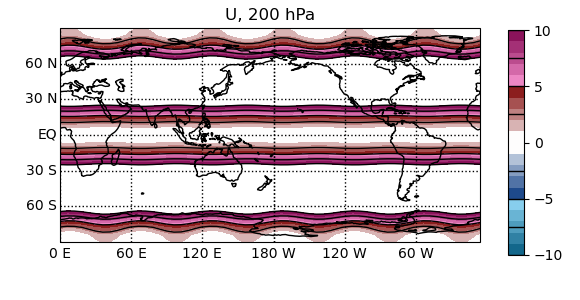
The interval algorithm is based on a larger “division”, which sets the tick labels in the colorbar (and, along with the ‘style’, the colormap chosen by default). Each division is split up into an equal number of filled intervals (‘nf’) and lined intervals (‘nl’). The latter can be omitted entirely by setting ‘nl’ to zero. The width of each interval can be specified explicitly with ‘cdelt’; if this is not given an appropriate value will be guessed.
Other types of contouring can be produced by specifying the ‘type’ keyword argument; possible values include:
Value of ‘type’ |
Style of plot |
Underlying helper function |
|---|---|---|
‘clf’ |
Filled contour plot (default) |
|
‘cl’ |
Line contour plot |
|
‘log’ or ‘log1s’ |
Logarithmically-spaced contour plot |
|
‘log2s’ |
Two-sided, logarithmically-spaced contour plot |
|
How the rest of the arguments passed to showvar() are parsed depends on
this argument. In each case these make use of a particular helper function
which determines the appropriate contour intervals and colourmap; keyword
arguments are passed through to the underlying function. While these details
are transparent at this level, this is carried out by returning a dictionary of
keyword arguments which is then passed on to the underlying vcontour()
command which provides lower level control over the contouring performed.
Showlines, Showgrid
One often wants to plot multiple variables at once. Two useful commands for
this purpose are showlines() and showgrid(). Multiple
1-dimensional variables can be plotted on the same axes with
showlines().
In [10]: tm = t2.Temp.mean('time', 'lon')

# Multiple profiles
#@savefig showlines_ex.png width=4in
#In [2]: pyg.showlines([tm(lat=l) for l in [-60, -30, 0, 30, 60]])
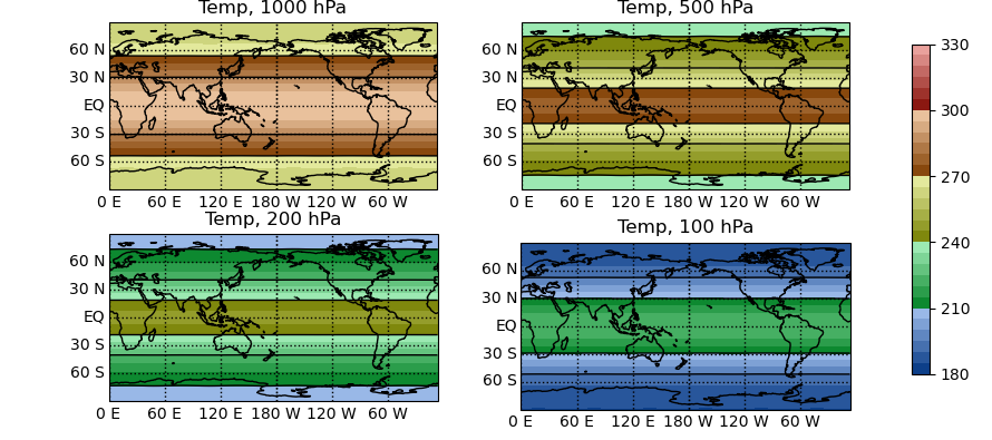
In a similar vein, multiple contour plots can be plotted in a grid with the same contour intervals and a common colorbar.
In [11]: tm = t2.Temp.mean('time')

# Multiple contour plots
In [12]: pyg.showgrid([tm(pres=p) for p in [1000, 500, 200, 100]], ncol=2, style='seq', min=180, cdelt=30, ndiv=5)
Out[12]: <pygeode.plot.wrappers.AxesWrapper at 0x7f3727644670>
Finer control
There are also lower-level plotting routines which can be used to construct plots with a finer degree of control (see Plot module for a list). For examples of how to use these routines, see the examples given in the Gallery.